Color is powerful, evokes strong emotions, and alters moods. Bold colors and large prints are “in” right now, and we don’t see them going away anytime soon! These colors come with their own challenges though. What should you pay attention to when updating to a more energetic color scheme?
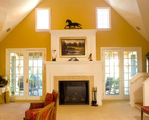
Yellow is timeless, optimistic, stimulating, and cheerful, but the wrong shade can be stressful and even increase anxiety. It looks very different depending on lighting and amount of natural light the room receives throughout the day. Pale yellow can make a room feel larger, buttery yellows are warm, comforting, and intimate, and muted yellows can be very peaceful. Saturated yellows are great as accent walls in spaces and climates that don’t get much natural light, and are bright and refreshing paired with white or orange. Coordinating colors is very important. Grey, white, and yellow feels sophisticated. Softer shades of lavender and earthy browns create a relaxing vibe with mild yellows.
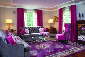
Who doesn’t love a bold, dangerous red? Super energetic and warm, red is adventurous and bold, but can go wrong if overused. Try a red accent wall to start, or vary shades of red to avoid overpowering. Red is great in a dining room as it stimulates the appetite! Looking for something a little sweeter? Pink is hot – and the hotter the better – but the wrong shade can be babyish or sickly. Balance hot pink with dark grey or black to create a fun and passionate atmosphere.
Sophisticated and absorbing, black is a naturally moody color. It needs to be selected and used very carefully and is great paired with white patterns and a splash of a bold color like emerald green, red, hot pink. A chalkboard wall may be a perfect solution for your home or office, but always use black sparingly and incorporate it with high contrasting white, ivory, or bright colors.