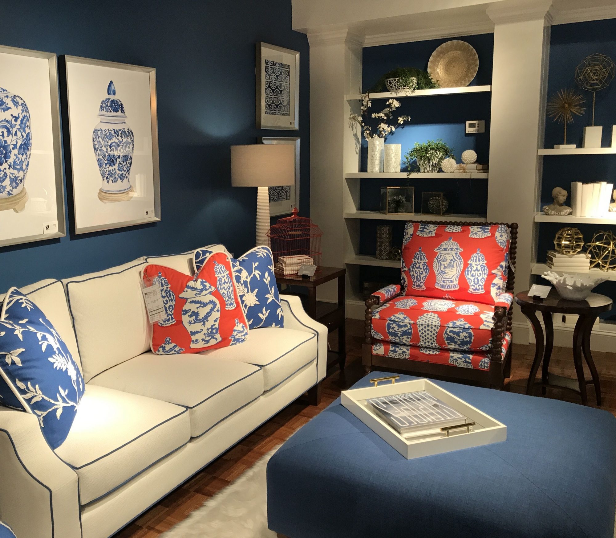
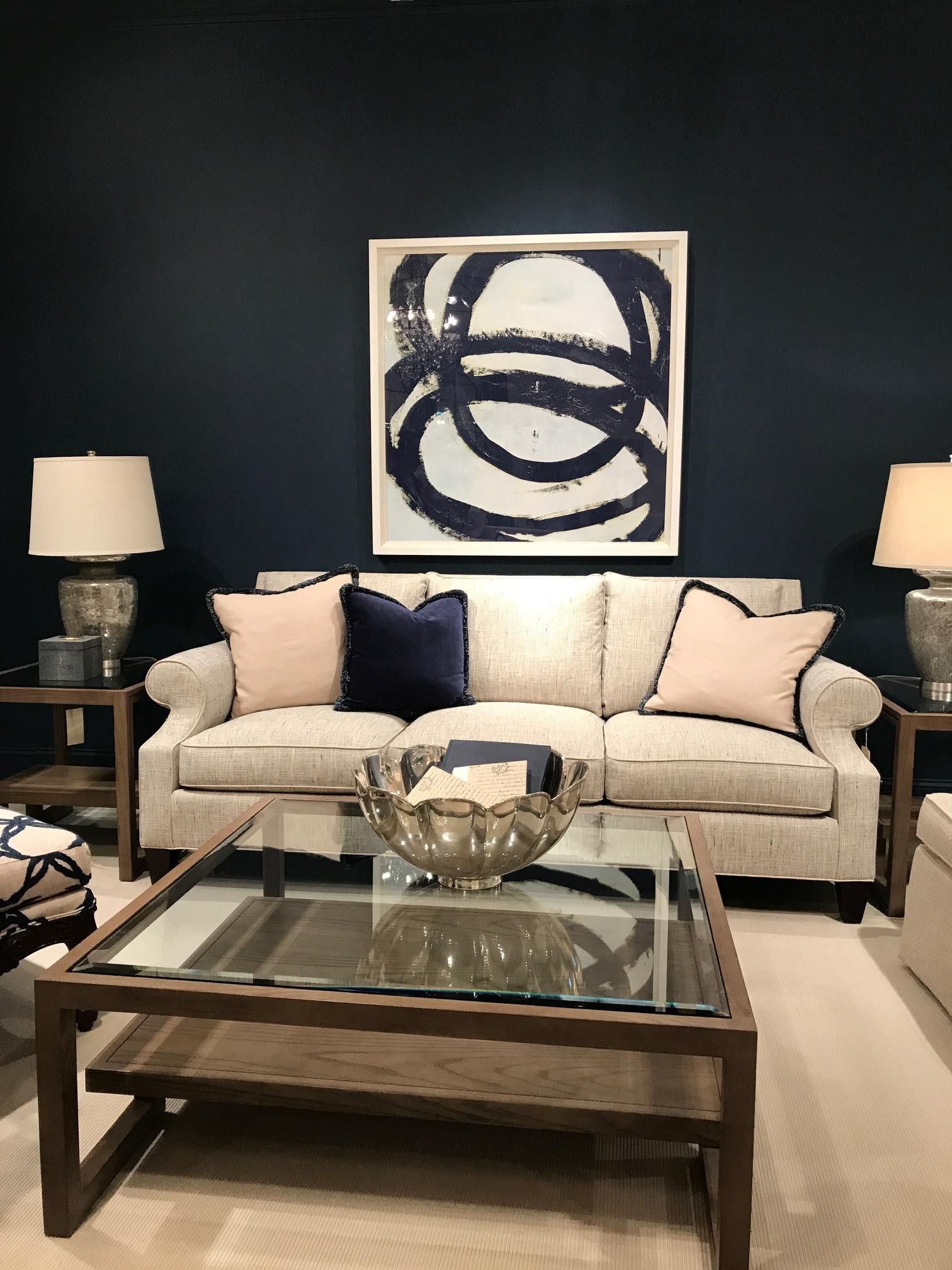
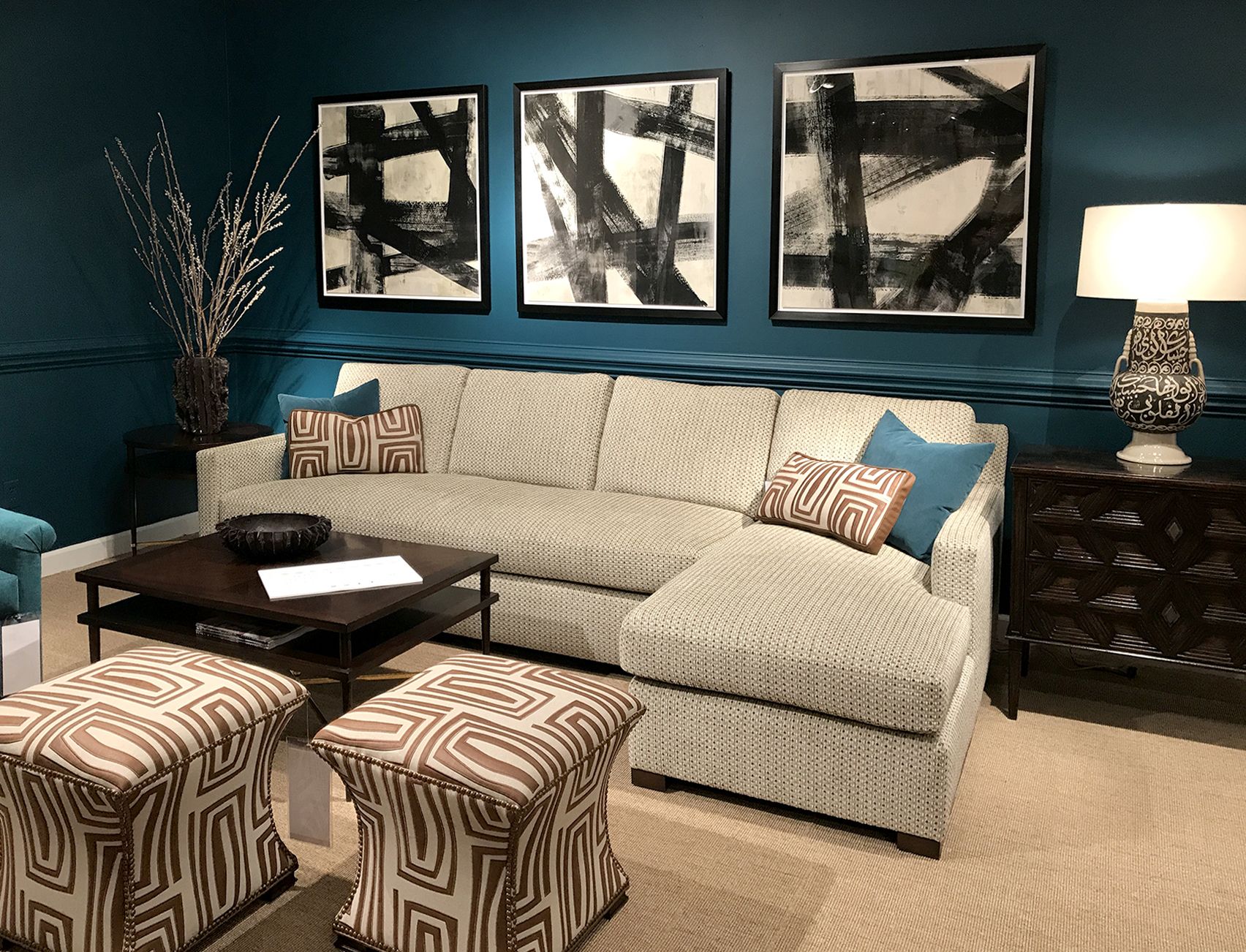
At High Point’s Spring Furniture Market, I was determined to find the most popular color. Any guesses? It wasn’t Pantone color of the year, Greenery, it was blue – in all of its wonderful shades, tints, and values. We saw stunning sapphire, azure, beryl, cerulean, cobalt, indigo, navy, royal, sky blue, baby blue, robin’s egg, cyan, cornflower, midnight blue, slate, steel, Prussian blue, etc. Each variation of blue reflects a different sensibility. Dark blues exude elegance, richness, sophistication and intelligence. Royal blue is vibrant, demanding attention, while light blue creates peaceful, soothing and restful feelings.

Why is blue so popular now? It is associated with open spaces, such as the sky and sea, representing expansiveness, inspiration and sensitivity. The world is expanding quickly, inspiration is at our fingertips, and we are all more sensitive to individual differences. Is this why blue is trending? Blue also reflects confidence, stability, and intelligence. These qualities are why there are blue corporate power suits, and why police officers and U.S. Navy officers wear blue uniforms. Considered highly corporate, blues with rich, dark tones are most often associated with confidence. Is the blue trend predicting confidence in the future and our economy? I certainly hope so!
Blue can be strong and steadfast, or light and friendly. This color family has positive effects on the mind and the body, initiating production of chemicals that are calming, and creating feelings of tranquility. However not all blues are serene and sedate, they can also be dynamic and dramatic.
Some blues can even be considered neutral, combining well with most colors. I love cyan and rich blue hues with coral, or in combination with spring or lime greens. Creating a monochromatic scheme with various blues mixed together can be dynamic, and of course blue with white is so nautical. Designing with the primary colors of blue, red and yellow can be playful and bold. The trick for this palette is using the right amount and correct placement of these intense colors.
When you look at upcoming architecture and design magazines, remember this trend and observe if you see more blues than before. What do you think it means?