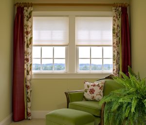
Complementary color schemes provide a clear separation of colors and can feel more formal.
What does 60-30-10 mean? It’s a tried-and-true interior design formula: 60% of a space should be a dominant color, 30% a secondary color and 10% the accent color. This formula works because it creates a sense of balance and allows the eye to move comfortably from one focal point to the next. The easiest way to follow this rule is to use the dominant color on your walls, the secondary color on furniture or upholstery, and 10% as the room’s “jewelry”.
If it feels daunting to select colors, choose just two colors now (you can add the accent later). Do you remember the color wheel from art class? Let’s talk about the three easiest color schemes to design with: Complimentary, Analogous and Monochromatic.
Complimentary colors are directly across from each other on the wheel: red and green, blue and orange, or yellow and purple. Typically one of the colors in a complimentary scheme is primary. Rooms decorated with complementary color schemes provide a clear separation of colors, feel more formal and can be visually challenging. Add the 10% accent color through pillows, lamps, trim or artwork.

Analogous colors are adjacent, like yellow, lime, and green.
Analogous colors are adjacent to each other like yellow, yellow-green (lime) and green. When using this scheme, note that each color alters the tint, intensity and value of the other colors. A room with this type of scheme is restful and refreshing. Fabrics with patterns are often a good starting point for this scheme.
A monochromatic scheme uses various shades or tints of one color such as dark grey, light gray and grayish white or navy blue to light blue. When working within this scheme, include a variety of textures and patterns to create interest. Rooms designed this way are usually restful, spacious, and great backdrops for art.
Most people struggle with value, the relative lightness or darkness of color. Try designing an interior space by replicating the color values in nature. When you do so, add a small amount of black to represent outside shade – a black picture frame, lampshade, artwork or bowl – and you will clarify and enhance all other colors in the space.


